▼
Christmas Spirit
So I've been busier than busy this season with finishing sketches for the 2 books I'm working on and all the holiday hoopla. I haven't had time to really keep up on my illustration blog this month but most of you probably haven't had time to look anyway. But today I felt like painting something to get me more focused on the real meaning of Christmas and not all the things I have left to do on my list. I just did it quickly in painter. (the sketch by hand) May Christ's peace be felt in your lives as well.
Illustration Friday: the zoo
What's more like a zoo than a school cafeteria. This is an old illo I did for fun one day that fits the topic. I'm swamped illustrating 2 picturebooks that have worked themselves into the same schedule...I'm finalizing sketches and starting painting on both. I'm unbelievably busy with that and all the holiday season stuff. I need a nap.
Illustration Friday: Trick or Treat
Logo Design
I don't often do logo designs b/c I'm not a graphic artist. But my Aunt and Uncle requested one for their racing team (MoJo Racing - for Monique and John) and you get what you get when it's pro-bono right? Well, here's what I came up with per their requests. A graphic designer probably could've done better but at least it's not completely hokey like a lot of "do-it-yourself" logos. Unless, I'm horribly mistaken. You tell me.
Illustrating an idea...PEACE
So I'm working on illustrating that Christmas book and was pointed in the direction of illustrating the idea of "peace" (Christmas style) in a simple illustration. Here are 3 I came up with. I still need to do one of them over again to get the watercolor exactly right. I like the colorful one b/c I like color...but the star doesn't stand out enough. Which one do you like?
Client Approval
I'm working on illustrating a little Christmas Gift Book (out next year) that is a bit more for adults than children. I've never illustrated for the adult market before but was chosen to do this book b/c the publisher liked my style. The story does have a child in it, but the client wants a more grown up look to the illustrations. I was asked to show some of my illustrations before I got too far into the project. This was done for the opening page. The publisher called and said they loved the piece and the watercolor technique...BUT (there's always a big BUT)...they were hoping for even less detail and more simple illustrations...more still life type vignettes. That just makes my job all that much easier. I need to think more "greeting card" sophisticated and less silly children. My mind gets stuck there sometimes. The client worked out their initial ideas for each illustration so I could have a better idea of what they are looking for...much easier than reading someone's mind. Because, in the end, it's all about the CLIENT APPROVAL! They were great to let me know they didn't want to stifle my creativity in any way, but I said I could go with it and make it my own...but knowing what direction to head in makes it much easier to reach the desired destination. This is why some fine artists say that illustrating is just prostitution of art (sorry for the blunt term). But to me, it's just a collaboration and the end result can be just as magnificent.
Educational Reader Done
Calling all illustrators and writers of Children's Books
I'm on the planning committee for a conference sponsored by Utah Valley University (formerly Utah Valley State College) and SCBWI in March (the 20th-21st). We already have the main Keynote Author booked, Kirby Larsen. But, I was just able to book David Small and Sarah Stewart as our Keynote illustrator and picture book author. We are SOOO excited. David has won the Caldecott Medal and the Caldecott Honor Medal. He wrote and illustrated "Imogene's Antlers"...a classic you probably all know. Anyway, Book your calendars and if you are anywhere near Utah in March, you should come. IT'S GOING TO BE FANTASTIC!!!!!
Illustration Friday: Captain
Illustration Friday: Missing
Illustration Friday: Poem
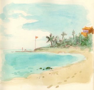
I saw this theme and instantly thought of that poem "Footprints" which has been WAY overused in my opinion. I used to like it when I was young but it's lost all sensibility for me now. But I had this illustration in my mexico sketchbook that speaks to that poem. (notice the footprints) It's actually a nice poem, but as I said, just way overused. If by chance though, one of you have not read it, here it is. It may be quite inspiring to you if reading it for the first time. I should look at it that way again
Footprints in the Sand
One night I dreamed I was walking along the beach with the Lord.
Many scenes from my life flashed across the sky.
In each scene I noticed footprints in the sand.
Sometimes there were two sets of footprints,
other times there were one set of footprints.
This bothered me because I noticed
that during the low periods of my life,
when I was suffering from
anguish, sorrow or defeat,
I could see only one set of footprints.
So I said to the Lord,
“You promised me Lord,
that if I followed you,
you would walk with me always.
But I have noticed that during the most trying periods of my life
there have only been one set of footprints in the sand.
Why, when I needed you most, you have not been there for me?”
The Lord replied,
“The times when you have seen only one set of footprints in the sand,
is when I carried you.”
Mary Stevenson
It's not all drawing
I mostly focus on the drawing part of what an illustrator does. But I just thought I'd share this tid bit to show that we all do have a life outside of the day/night job of illustrating. Although, our lives sometimes involve using a little bit of those skills.
My mother-in-law puts on a great "fair" for the grandkids every 24th of July (which is a holiday here in Utah celebrating when pioneers first came here to settle the valley). She does a great job. She always has a "fishing pond" but usually just puts up an old sheet. Well, this year I was commissioned to spray paint a new sheet and add fabric fish. It turned out cute and the kids had a great time (and so did I, eating way too much).
Illustration Friday: discovery
This plays on the theme on 2 levels...
first...the fish discovers the worm...
second...I discovered the sketch of these fish when looking through a college sketchbook as I cleaned out my closet.
I liked the fish and didn't like much else in the sketchbook. Thank goodness I've improved.
Hopefully the next 10 years will bring the same level of improvement.
I colorized the lines in photoshop and threw on watercolor in painter.
Another Sample
Illustration Friday: twist
Workbook Illustrations
Family Reunion
So I had the chance to fly back to the midwest and get together with my parents, 6 brothers, 2 sisters and their families for a great big family reunion. We had it at a Kentucky State Park about an hour and a half south of where I grew up in Indiana...a place we went to as children for family vacations...Pennyrile. It was WONDERFUL! The weather was perfect...not overly humid or hot, and the reunion with family was great. Here's my daughter right in front of our lodge room. This was such a peaceful place. Funny enough, a regional SCBWI was being held for 2 of the days we were there. The small gathering of someday authors and illustrators was fun to see and chat with. On the planeride back (which was bumpier than I like), I drew this sketch inbetween working on some workbook illustrations which I need to finish up this week. Inspired by nostalgic memories.
Illustration Friday: camouflage
This is an illustration from my book "Already Asleep." I don't think I've posted it before. But it fit in beautifully with the theme this week. I love the mouse dangling from the boy's shoe. I had fun putting the mouse throughout the book. I always try and add something unexpected or secondary in the books I illustrate.
HOORAY!!!!!
I just finished a 32 page picture book for Woodbinehouse Publishing. To quote them "Woodbine House is a publisher specializing in books about children with special needs." The book I illustrated deals with Autism. It was an interesting project to be involved with. I was able to learn a lot along the way and hopefully it will help those who need it.
Illustration Friday: paradise
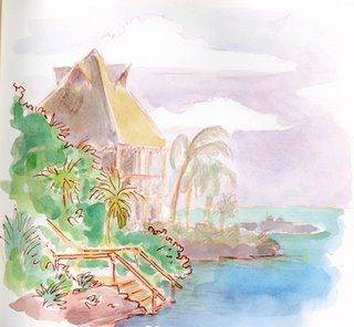
My paradise most recently was Mexico at "Xel-Ha" near Cancun. I did this sketch relaxing on a cliff edge after swimming with the dolphins (which was completely amazing). Snorkling here we saw TONS of fish and a stingray. It was paradise. (the photo is of my husband and I snorkling in a cave). This was the perfect place to go in the middle of a cold Utah February.
Mailers sent
Well, I got the postcards back from the printer a week and a half ago (or more). They turned out perfectly. I ordered a stack of business cards as well. I got 500 oversized postcards and 500 business cards for $110 including shipping from VISTA PRINT. It was a special offer but even their real prices beat Modern Postcard who I used to use for postcards. I was only concerned about the quality. But the color turned out great and it all worked seemlessly. So I'll be using Vista Print from now on it seems. The postcards have been mailed (before the rate hike)and we'll see if any jobs come as a result.
Illustration Friday: Polar
Illustration Friday: Fortune
My mother-in-law loves items with a history. She's great at finding old pots, benches, books...things with a story. Put them all together and they are worth a fortune. She only wishes she could have a fortune to buy all the cool stuff. Don't we all. Anyway, here's a picture of a girl in her grandfather's antique shop. The lady wants to buy the grandpa. This was a spec illustration done for a publisher for a manuscript called "Not For Sale." I didn't get the job but I loved the finished piece.
Sending out mailers
Illustration Friday: Green
Well, I went out to Guy Francis' blog and saw this cute little pixie looking off to the side. That made me wonder, is she just day dreaming or is she flirting with a pixie boy. So, I came up with this kid. I thought he went with the illustration friday theme of green pretty well...leaves, spring, etc. Check out Guy's girl here.
I sketched it with a brown pencil and painted it in painter with my computer and wacom.
The projector and School Visits
Well, I've used the projector I wrote about a few posts ago for over 3 school visits now. I'm not a know it all on this projector and maybe if I new a little more I wouldn't have listed some of these cons, but here's my initial review.
Here are the pros...no laptop needed, thumbdrive holds all the presentation, bright display, easy operation, can place it close to the screen and get a large picture, has a button to blank out screen if you need to just talk with no picture up for a minute.
Cons...the initial upload of images is a tad slow (all depends on file size) but this can be negated by arriving early to set up; the lag between when you push the remote's NEXT button and when the picture changes can be unpredictable (depends on file size too); some images get the halo effect around the edges; there's not a great zoom differential on this projector...can't zoom image down too small if you're far away.
The Cons list looks larger but it is really only 4 things (explained) as opposed to the 7 pros listed. So, for me, the pros outweigh the cons.
Illustration Friday: Snap
This is an illustration of a mother about to SNAP! ...it's always at dinner time...everything comes crashing down. Drawn from a little personal experience here obviously. Luckily, I have a husband who's great to take over for me at these times. Thanks, sweetie!
Here I show the sketch scanned in and tinted brown. Then I painted in in Painter. I'm still trying to get more used to it and make it look more real. I think the real thing (watercolor) still can't be matched.
Illustration Friday: I Spy
Conference on Children and Literature
Sorry it's been so long since my last post. I've been dealing with my 3 year old's kidney problems, which thankfully are now all resolved after many tests, procedures and 2 surgeries.
After all that, I was able to take a break and attend a conference I was on the committee for. I hosted the guest illustrator, Brett Helquist (illustrator of the Series of Unfortunate Events books and many others). He taught some great breakout sessions on composition and character design. He suggested illustrators study "Picture This" by Molly Bang and internalize it. He also talked about Balance, Motion, Contrast in relation to composition. His theory on Balance was great...he called it the elevator scenario. If there are 3 people (say one larger person and 2 smaller) on the elevator and one gets off, the other two shift positions or there is tension (don't want to stand next to each other if there's room). See the illustrated example.
Illustration Friday: Hide
This is a piece I did for a book I was writing myself. Philomel had it for a little while and I was working with an editor there on it but it never came full circle. Didn't make it through the big board room. It was also one I painted in Corel Painter. I loved this little girl and her great aunt. They were fun to draw. I seem to lose some of the charm in her character as I do other characters and attempt to capture the same elements that are in her.
Win a Hippo
I went to Peruvian Park Elementary School last night and did a couple of presentations for kids and their parents for Literacy Night. It's always a lot of fun to share my love of illustration with kids. They even help me create while I'm there. Because I only had 30 min for each presentation, I only had 9 minutes to draw at the end. I call on students to come up and help me create a character. Last night we created Henry and Hilda Hippo. I told the kids I'd post the Hippos on my blog and they could see the finished product of their creations (we only got the basic colors blocked and the outline done besides the head...9 minutes isn't very long). So here they are...Hilda and Henry.
These are the questions I asked the kids to help fill out the character profiles of Hilda and Henry before we illustrated them. See if you can answer the questions by looking at the picture. I'll post the answers another day.
What is his/her favorite color?
What is his/her favorite candy?
Is she/he messy or neat?
What is something she never goes anywhere without? (this one only applies to Hilda)
What does he/she like to do? (This one is the hardest to decipher from the illo)
I am also announcing that Hilda and Henry can each be WON (mailed to you). I asked the kids (you can participate too) to send me a story they write for Hilda or Henry. The best story wins...that simple. I'll post the results later on my blog (and possibly the winning story if permission is granted).
Illustration Friday: communication
This was just another test with Corel Painter and my Wacom. I downloaded a trial version of Painter X and like the pens and markers, but the watercolors still need work. I just used my Corel Painter 3 essentials to do the painting on this. The sketch took less than 5 minutes with my Wacom tablet. The color...about 30 but that includes interruptions from my 3 year old and 8 year old giving tips. I like the giraffe, not thrilled with the monkey. Don't ask me what made me think to illustrate this topic in this way...I don't know. I drew the giraffe first and then thought about an animal that seems to chatter...like they are spreading gossip or something. So, out this came. But hey, I'm proud of myself for finally doing something original again for illustration friday.
School Visits anyone?
I've been doing some school visits and parent night presentations (more and more just recently). Over the last few years, I've always just carted my grandma's old old slide projector around and showed my slides through it's dirty lens. But it finally died on me. The last time I did a little 50 minute presentation at a young writer's conference a week ago, I borrowed my brother's digital projector (thanks Eric). IT WAS SO MUCH BETTER! Since I already have 2 more visits scheduled in the next 2 weeks, I figured it was time to pony up and buy my own. I didn't want to lug a laptop every time along WITH the projector so I thought of my options. I could use a video ipod but those are a few hundred dollars. OR...I could use a USB Thumbdrive.
I found that some digital projectors have a USB 2.0 port and will read jpg images or mpg4 videos. The one I bought is the HITACHI CPX1. It is VERY lightweight and has a high number of lumens and all sorts of great functions for computerless presentations. TheNERDS.net was the cheapest place I found it (that was reputable) and they were GREAT. The projector arrived and I LOVE IT! It's much brighter than my brother's was for those school rooms that don't darken well, and the USB reader worked beautifully. All I have to take to schools now is this little 3 lb projector and a thumbdrive. I can't wait to try it out next week! Wish me luck.
Thumbnails for new book
Illustration Friday: Gravity
This particular piece was done recently and just appeared in Highlights Magazine's February Issue. Hopefully gravity won't cause more than her hair to fall down. The editors were worried about this in an earlier sketch I sent shown here as well. I thought it was a little more fun in this position...but they were afraid of gravity. No potential accidents in the children's illustration world. It's like those warnings on a box of matches that says FLAMMABLE! Duh! It's all just so no one has an accident and then sues whoever they can instead of taking responsibility for their own actions. I love all the disclaimers before TV shows now as well. Anyway, here's my disclaimer...
Do NOT attempt to hang upside down from anything or GRAVITY may cause you to fall. Should you not heed this warning and an injury occurs, SUE GRAVITY, not me. I will not be held liable for your actions. Have a great day!
Illustration Friday: Crash
A Little Sabbatical
So I've been gone for a while, a sort of sabbatical from Blog Posting. I apologize if there are or were any faithful readers out there. I couldn't keep up with it all so had to let go of some. But Hey, I'm back. After a very relaxing 10th Wedding Anniversary trip to Mexico with my husband...I'm back.
While there laying on the beach, by the pool, and roaming about, I kept a sketch journal. These are just 3 sketches from it. One is looking down our beach, the other is of a palm tree by the pool and the other is a view of Xel-Ha (a great ecological park we visited). You can see the actual photos my husband and I took HERE and artistic photos taken with a holga HERE.