Illustration Friday: Holiday


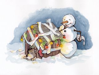
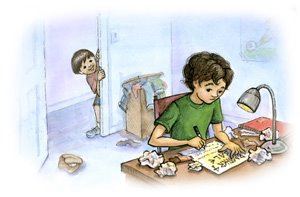
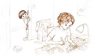
Here's a piece with some characterized animals in it...haven't shown those for a while. Our Holiday seemed a little like this scene at times...everything a little on the hectic side. But it was all good in the end and the spirit of it was lovely. My kids weren't greedy and loved their gifts, the food was good, and I got to see my sister and her family for a few hours (they live out of state).

Illustration Friday: IMAGINE


Imagine you were transported to a fairy land where you ruled as princess. At the end of a long day, you find yourself back in your room with all your toys. Was it real?

Illustration Friday: BLUE


I was searching through old photos to see if something would spark a thought and out came a little picture of my little boy at the hospital emergency room. So sad. When my son was 2 I accidentally shut the car door on his hand. There's not a more horrible feeling than hurting your own child. He and I both were pretty blue. I thought..."what a horrible mother I am." It's not a fun feeling.

What do snowmen do at night?


I went to a lecture given by illustrator Mark Beuhner the other night. He showed a lot of work along with originals from his new best seller "Snowmen at Christmas." They were wonderful and full of color. His first snowman book was called "Snowment at Night," all about what snowmen do at night. Then I checked Guy Francis' blog (who went to the lecture as well) and his toilet paper snowman inspired me. I also used a sepia ink instead of black as the accent on the outline as Guy suggested previously. So, here's what came of it.

Art for Christmas Gifts


This year I decided to do portraits of my brother's 5 boys for him and his wife for Christmas (I just finished the last of them). I had my parents provide some pictures as reference so it'll be a surprise (unless they read this blog of course...which they don't). I did portraits of my sister's kids a few years ago for her. I think doing portraits of people you know has to be one of the hardest things. It's hard to show that light in their eyes or that personality you know is in there. It's much easier for me to draw someone I've never met. But hopefully these will be to their liking. This picture is of their second youngest (4 years old). I use a beige canson paper and black and white prisma color pencils.

By the way, I've finished ALL of the spot illustrations for the Already Asleep book. It feels good to have 1/2 the book done in a manner of speaking. I think the double page spreads will be harder than the spots and more time consuming.

Painting More Spots


So, my days have been spent painting the illustrations for the Already Asleep book. I think I'm seeing spots...spot illustrations that is. I decided to do all of them first and leave the double page spreads for last. There are 25 spot illo's in all. And then 8 double page spreads and the cover. Anyway, here's another spot I liked...I used my son as a reference.

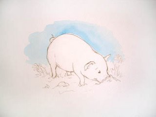
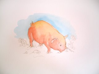
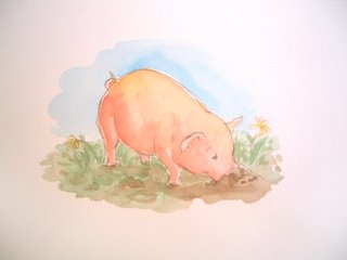
I liked the comment on my pigs about trying a sepia ink instead of black. Maybe I'll do a non book illustration and try that there (if I can organize my life well enough to have time to do an illustration other than work illustrations). It's a hectic time of year. Wish me luck on that endeavor.

Illustration Friday: Small


So, I did this spot today and took the accompanying photo so I could post it for Illustration Friday...both illustrate the topic to some degree (see the SMALL mouse). My little boy Spencer (4 years old) wanted to sit and paint like mommy...I loved it. I told him what I was doing and he came up with this. In his words "The guy" (on the top right) "with the lightsaber is the bad guy putting in SMALL poisons in this pipe supply." (the green lines are the pipes and the red is the poisoned water or whatever.) I must say this makes me wonder what he's overheard on the news concerning terrorists and contaminated water supplies or if he's just exhibiting the normal boy interest in bad guys. Hmmm...

Spots for Book: the process

Here's one of the first spot illustrations I did for the book. The illustrations are well under way but I finally am taking the time to post this. (I had to get some of the images off of my digital camera). I took pictures as I worked in stages and then scanned in the final product. I just thought I'd share the process. This is Lynn...

I print out the sketch, then paint in the background making sure to let areas I don't want to bleed to dry before going on. Then I paint in the main elements. Finally, I go over important lines with black ink.

I do all four spots for the double page spread at the same time so my color is consistent on the page. I just move to the next one as the previous sky or background is dry and just rotate like that.

I guess I should have scanned each stage so the color was correct. I tried to take the picture without flash hence the dark corners and skewed color. Just imagine the color tones on the final product on each stage. Sorry. I just didn't want to take the time to get down from my desk and scan each stage. Now I know that the camera doesn't quite do the work justice. Oh well. You get the idea.

Some Color, Some Car, and Some Pie


This is the final color version that I never posted of that magazine illustration I did a while back. I thought I'd better show the final product not just the sketch. I haven't had time to start scanning the Already Asleep paintings as they finish, but I will soon hopefully.

We've been car shopping this week b/c we were down to one car (which doesn't really work when your husband has to commute to work and you've got 3 kids at home involved in school etc.). After much searching and deliberation, we got a stellar deal on a Chevy Tahoe. We're excited.

Today, I'm going to paint another spot from the Already Asleep book and then I've got to bake 2 fruit pies, 2 pumpkin pies, make a big jello and put together some appetizers for Thanksgiving at the in-law's tomorrow...and all my kids are home from school today. Busy day!

Crawling out from the construction

So I haven't posted for the last week because my office has been disassembled and I had to do a DVD slide show for my husband's grandmother's 75th birthday (on a moment's notice). Anyway, the unfinished basement where my studio was had no walls and no heat and extension cords for electricity. As the winter set in here, I began to freeze down there. So we moved the computer and various items to the bedroom and had it framed and heating ducts installed. After I layout the wiring schematics (sp?) my husband will drill and lay the electrical wiring and install insulation. My hands were turning numb down there and I couldn't take it anymore. To make the noise worse, the siding people came to replace our defective siding (which was still under warranty) this week too. It's been quite the mess and I have quite the headache. I am so looking forward to getting into the peaceful rhythm of painting next week. Thanksgiving will be at my mother-in-laws so I am glad I won't have to host or prepare the whole meal. Thankfully, my husband took me up to Robert Redford's Sundance Ski Resort for one night as a surprise get-away...it was WONDERFUL! But I'm itching to get back to the real work in a warmer environment.

Cover illustration

So I got all the interior sketches done for the "Already Asleep" book. Since there wasn't one main event or one character to focus on in the story, I had a hard time deciding how to do a somewhat interesting cover. Since the book is basically about being tuckered out, I decided to put all the characters in a heap, asleep (minus the horse...it didn't fit in the design). The publisher loved it and I thought it turned out alright for a bunch of people (and animals) sleeping. I just had to concentrate on the positioning to make it more interesting and cute. As you can see, the dad is in basically the same position as the "remote" illustration. This was intentional. I remember seeing my dad fall asleep in the same position practically anywhere...especially at long church meetings. I've never been able to sleep like this. Is it one of those things inborn in men, like hogging the remote?

REMOTE: Illustration Friday


This is a late addition to the Illustration Friday. I decided to start participating as a means to keep my blog active as well as my creative mind. (Mainly it was prompting from Guy Francis which got me to do it). So this last week's topic was "remote." I'm working on a picture book called "Already Asleep" as I've mentioned before. Skteches are due on Tuesday (no, I'm not done yet) and this one with the dad "already asleep" lended itself perfectly to add something in at the prompting of Illustration Friday....a REMOTE control. Anyway, hopefully I'll contribute a more finished piece next time.

Thumbnail to Final

Here's the final sketch for one of the thumbnail sketches you see below. I don't put value in my final sketches because I scan those in and then print them out onto watercolor paper and then paint them. I'll post the two subsequent pages that go along with this spread soon. I just don't have time today. I'm in the middle of moving boxes in my basement to make way for the framer to come and the Heating guy to put in the heating ducts before the freezing weather sets in. Right now my feet and fingers just get a bit chilled as I'm working. Come Spring, we'll finish off the whole thing. I can't wait!

Magazine Illustration Job


Just so you know, I won't be posting again until next week. I'm going to visit my sister. But here's a sketch I turned in today for a magazine spot illustration. Quick and easy job. Not the most creative freedom always, but it helps pay the bills. From here I'll print it out onto watercolor paper and start painting. Have a great weekend!

"Inspired" by Lunch


Well, I was repremanded today at an Author/Illustrator lunch for not posting to my blog more often. Guy Francis (www.guyfrancis.com) said I had to post more often and he'd be checking up. So here is a post for Guy who likes to see an illustrator's process.

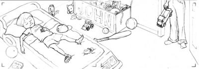
These are just a FEW thumbnails from the picture book I've begun working on called "Already Asleep," by Angelique Tarbox to be published by Moo Press, of Keene Publishing. They are about 3.75" inches long by 1.25" inches high...just so you know how small I start out. I just grabbed a few out of one column of sketches b/c you can't really tell what they are completely anyway unless you are me. I do a bunch of these and then I go straight to full size from there. Oh, I also print out my thumbnail boxes to draw in from my computer so I don't waste time drawing the boxes.

So, now Guy...any critiques? I'm expecting them since you asked to see more.

Feast or Famine


So it's been 3 months since my last post and here's why. On June 29, 2005 our house in Michigan sold and we had only 2 weeks to pack up and move across country to Utah. We found a house there and moved in on July 28th. Then the unpacking began. A few weeks later, most of the boxes were empty and the dust started to settle...JUST IN TIME FOR MORE ILLUSTRATION JOBS.

It's amazing. I was blessed to have no deadlines or projects during the months of the selling and moving, but as soon as my feet were propped up to relax, I got calls for 3 illustration jobs. The timing on all worked out great. One was black and white line drawings for a workbook due in 1 week, the 2nd was 7 full color illustrations for a 3rd-4th grade reader due in a total of 4 weeks, (the cover is to the right) and the 3rd was a more drawn out project...a picture book. It's final due date is January 4th. So, I decided to take a minute and post to my forgotten blog before I get into the full swing of the picture book (that is...beyond thumbnail sketches). I'll try and keep up to date with posts on the picture book's progress from now till completion. So stay tuned!

In addition, the box and book set I illustrated called "The Fairy Princess" will be sold at your local elementary school's bookfairs beginning this fall. It comes with a tutu and wand and a book about a little girl who imagines herself in a Fairyland. I'm trying to get extra copies to make available from my website as well. I'll let you know if that happens. Here's a picture of what the box looks like...

Recent Publication Hits Market


A board book I illustrated for a subsidiary of Lerner Publications is now available. It's called, "The Opposites of My Jewish Year." You can go to my site to purchase it www.jujubeeillustrations.com/books.html. Obviously it has a very select market...Jewish. It takes the Jewish holidays throughout the year and teaches opposites using objects associated with each. Hannukah, for example, uses the menorah to teach high and low (the middle candle is high..the shamash...and the other candles are low). Not being Jewish myself, I was grateful for the internet and the definitions of Jewish words and holidays I found there as I researched the illustrations.

Dog Walkers Finished

So, if you'll look in my previous posts, you'll see a sketch of a boy "walking" some dogs. Well I finally got around to painting the piece. Here's how it turned out. Notice I only outline the main focus figures in black line. For the other parts, I just leave the sketch line showing through.

Star Wars Episode III and other matters

Well, it's been a while since I posted, but a lot has been going on. We're in the process of selling our house and getting it ready was a bit of a chore. But my parents came to visit and I took my dad to see Star Wars Episode III on opening day (5-19-2005). It was the 11 am showing so we avoided the real lines of the previous midnight showing. We thought we'd be avoiding the costumers too but this sketch proves otherwise. They were trying to be Padme and Anikin...they were anything but. I found it humorous.

Out on the town

My husband and I drove over to Ann Arbor last night to hear a group called Opus21 perform at the Kerrytown Concert House. The group consists of a violinist, a saxophonist, a clarinetist, a bassist, a pianist and 3 percussionists (see their site for more info...www.opus21.org). It was an interesting group and an interesting concert. The concert house itself provides quite the intimate setting with chairs for only 80-100 people in an L shape room with the performers at the bend in the L. The musicians were amazingly talented; however, 5 out of the 10 pieces commissioned for the group and premiered last night were not so spectacular. They were quite modernistic and some even hard on the ears. The other 5 were quite enjoyable though. My husband and I were impressed with the talent of Judy Moonert, principle percussionist in the Kalamazoo Symphony orchestra, on the vibrophone...but funny enough, we also thought she'd be the perfect person for Mr. Rogers to visit on his show to talk about percussion. She just had the look. Here's a sketch I did of her with a Bic pen on the back of the program.

You never know when you'll need a character for a book. So look for the interesting people around you when you go out. I only wish I had more programs to sketch on because you should've seen some of the "high brow" attendees. Although, we did enjoy the post-concert cheese and veggie platters and mineral water along with the best of them.

Do you have any animals?

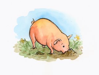
One of the first things I learned when I went to take my portfolio around NYC was that I needed to have depictions of animals in my portfolio; Every art director said so. Reason being, when you use animals, you don't have to deal with the race issue...you don't offend any person by not representing them or by representing them in a "stereotypical" scenerio. Plus, kids love animals. Pigs are a favorite for some reason. Here's one of my pigs...and yes, I'm being stereotypical seeing as the pig is "pigging out." But I don't think I'll get any threats from the Pigs Union about it.

And here's a sketch I just did breaking stereotypes...have you ever heard of an elephant ballerina? (then of course the background characters are being the stereotypical teasing kids you encounter if you're doing something you don't seem fit for).

So, bottom line. Include some animals. (I think I need a few more...off to work)

Sketching, Sketching

So, what does an illustrator do? The answer is sketch, sketch, sketch, sketch, sketch. I wish I had more time to do more of it. Whether you work on the computer or on paper or on canvas, the initial stages of an illustration start out with sketches. I usually start out with thumbnail sketches (tiny 2x3 inch drawings) to work out the composition. I ALWAYS do this for a book. But then my method sometimes varies from there in the larger sketch stage. Often, I like to sketch out different ideas for foreground and background and then merge the two in Photoshop. Here's an example of something I'm working on.


The boy and dogs were drawn separately from the background. That way, if I get a main focal point (the boy and the dogs here) the way I want them, I don't have to draw around them and worry about messing them up. I simply put a piece of paper over the main subject (thin enough to see through) and start drawing background ideas. Once I've got one I like, I scan both foreground and background into the computer and merge them. From there I can tweak sizes, proportions, perspectives...all sorts of things. After cleaning it up a bit, I print out the sketch on watercolor paper on my Epson 2200 and then paint. And if I mess up, I just print out a new one.

Advertising

Every illustrator has to advertise or promote their work in some way or they'll never get hired for a job. Some have an agent, some send out postcards, some mail out portfolios, and some advertise in sourcebooks like Picturebook. I do not have an agent. I try to go to New York and shop my portfolio around to the Children's Book Publishers about every other year. I also just recently purchased ad space in Picturebook 2006 sourcebook. But most often I send out postcards at least twice a year. I use Modern Postcard to print my cards, placing an image of mine on the front and my contact information and website address on the back. Here is the image I created and sent out on my Spring 2005 postcard.

Changing Styles

After focusing on a style done with Acrylics and some drybrush technique, I decided to try something new. I sent out a Christmas mailer in December of 2001 of a little girl and received a great response from Michael Green, then a senior editor at Philomel Publishing in New York.

He asked for more in that style...so I did more. And that was the beginning of my line and watercolor style.
Check out my website to see my work...www.jujubeeillustrations.com

My Published Books (so far)


My first book "What Could You See?" was published by and educational publisher soon after I graduated college. It was a low-paying job but gave me a taste of what it was like. It was a good place to get my feet wet. The second book "Hip, Hip Hooray for Annie McRae!" was my first retail market picture book. I had done a mass marketing campaign sending out a box full of Jujubee Candies and promotional pieces to art directors all over the publishing industry. It did its job and got my work noticed and I received a call for the book shortly thereafter. My third book "Herd of Cows, Flock of Sheep" was published by the same publisher 2 years later.

My fourth book, "Come and Play," was done for Mondo Publishing out of New York City. I got that job by the good old fashioned foot peddling of my portfolio in the city. I try and return to New York every other year to do the same thing.

But hey, that's not all. I have two more books coming out in 2005 for the retail market. One is a board book for toddlers called "The Opposites of my Jewish Year" and the other is a book and box package (complete with tutu and wand) called "The Fairy Princess." When they hit the shelves, I'll let you know.

Trying this all out

This is a new post from Julie. We are trying blogger out to see if it is going to work. See my site at www.jujubeeillustrations.com.