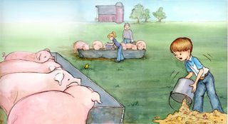
So being overwhelmed with family reunions, my dad in and out of the hospital and tight illustration deadlines, I've not been a good blogger. I probably could be more creative on this one, but instead I decided to address the issue of handling a skyline itself. I did this color proof for an editor this week for a Harcourt "Big Book" (those huge 20 inch high books for classrooms so all the kids can see it books). The best thing to do with a skyline is to keep it simple and faded. It's far away so make it look that way. This one actually fades for the text in obvious spots as well...but ignore that.


I've also included some sketches that aren't skylines, but deal with the same idea...silohetting the overall shape against the background. This is for a small 5th grade reading book for Harcourt as well.


the farm scene reminds me of home...and well...so does the second one :) haha
ReplyDeletegreat scence, I like the view and I love the piggies.
ReplyDeletecute illolo nice soft colors 2nd 1 is funny
ReplyDeleteVery nice! I love those pigs!
ReplyDeleteLooks great Julie. You're going to run out of paint working that big.
ReplyDeleteBeautiful illo! Very cute, and very well done. Love it!
ReplyDeleteVery nice! It almost looks like they are out doing their chores early in the morning when there is fog and dew. Wonderful!
ReplyDeletebeautiful illo, you capture the fresh atmosphere of a farm!
ReplyDelete