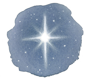
So I'm working on illustrating that Christmas book and was pointed in the direction of illustrating the idea of "peace" (Christmas style) in a simple illustration. Here are 3 I came up with. I still need to do one of them over again to get the watercolor exactly right. I like the colorful one b/c I like color...but the star doesn't stand out enough. Which one do you like?


I like the first one. . .
ReplyDeleteOooh, I really like the last one. . . how it is faded around some of the sides and has different colors with that texture. Very pretty. I like the simplicity.
ReplyDeleteTough call. I like them all.
ReplyDelete